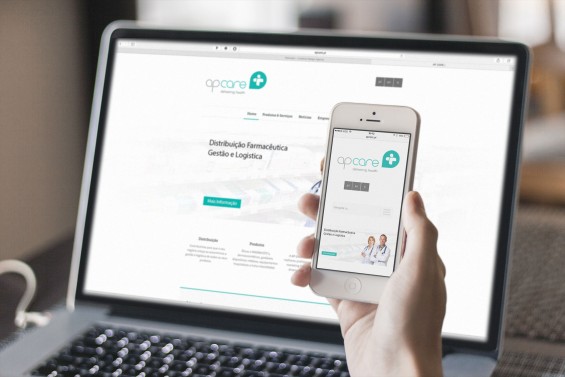
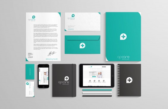
AP CARE PORTUGAL
pharmaceutical distribution company
The main goal for this new brand was to build something from the ground up with a clean modern look,
and a new visual take on the pharmaceutical distribution market.
O principal objetivo para esta nova marca foi construir algo a partir do zero com um visual moderno clean e,
com uma nova perspectiva visual no mercado da distribuição de produtos farmacêuticos.
![]()

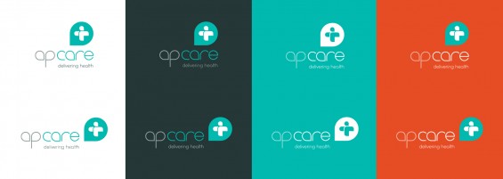
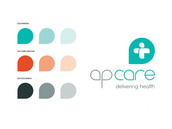
THE LOGO
If you look beyond the obvious universal symbol of the healthcare cross, you can see that it also aludes
to a man caring a bag, and extending his hand in a sign of greeting.
The inspiration was the the mail carriers and delivery guys themselves. Like them, AP CARE is responsible
for the delivery of a large scope of healthcare products and devices, right to the client’s hand.

THE FONT
Elegant and minimalist
Handmade and inspired from the Fontfabric’s Nexa Light.
THE TAGLINE
The tagline ‘Delivering Health’ became so suiting and obvious that was the perfect match to this brand.
![]()
![]()
![]()
![]()